E-Commerce Trends Point Towards Responsive Design by Market Action Research
(Last Modified: )
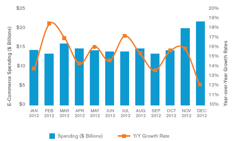
With each passing year, new startups with ample innovation will emerge in the consumer web. Despite economic uncertainty, the retail e-commerce sector showed robust growth. The total U.S. e-commerce spending reached $289 billion in 2012, which was a 13 percent increase from 2011.
E-Commerce is Here to Stay – Growth Trends in E-Commerce
The research is in for 2012, and as many may have already guessed, it was another year of slow progress as the U.S. fought its way out of a recession. The average unemployment rate floated around 8 percent for much of the year, but in the face of this adversity the retail e-commerce sector showed a year-over-year growth in the mid-teens throughout 2012.
E-commerce experienced steady growth in the travel sector of 9 percent to $103 billion, while retail e-commerce saw a jump of 15 percent to $186 billion for the year. The 2012 online holiday shopping season showed a solid growth rate of 14 percent to $42 billion in spending from November through December, but the season suffered due to the fiscal cliff concerns that wore down on the American consumer. As a result December yielded less than expected return, but with a Y/Y growth of 12 percent.
M-Commerce Trends – 11 percent of All E-commerce is Now Mobile
As consumer spending via e-commerce posts noticeable returns, we begin to see an emerging trend in Mobile commerce sector. Currently mobile commerce (“M-Commerce”) begins to now represent about 11 percent of the all e-commerce spending in the U.S.
While e-commerce continues to gain more prominent placement for businesses looking to stay competitive, m-commerce is now beginning to gain share from traditional retail. Recently big box retailers such as Best Buy have reported that smartphones have increased “showrooming” behavior, which is where a consumer price compares a product with their phone to find the best price. This behavior has been disrupting the establishment of brick-and-mortar retail. Conducting purchases via smartphones has not yet become main stream yet but is starting to catch the eyes of big box and small business alike. comScore, an internet technology company (NASDAQ: SCOR), estimates that m-commerce transactions (from both smartphones and tablets) now account for approximately 11 percent of all e-commerce spending. This suggests that m-commerce is a metric worth keeping a watchful eye on during this upcoming 2013 holiday season.
Next Generation of E-commerce is Responsive
Not only do a majority of Americans now own smartphones but more recent adopters are also learning how to use them in diverse ways. M-Commerce is quickly becoming a threat on multiple fronts. Brick-and-mortar retailers are now in the races to compete with e-commerce retailers who have now become double threats because of how mobile devices are enabling more choices for consumers. As the e-commerce and m-commerce channels continue to post positive gains, we can expect the remainder of 2013 to become increasingly more challenging for companies to maintain their market shares on all channels.
Mobile users are not only becoming more savvy, but also expect the same experience on their home computers as they do on mobile devices. Desktops tend to have a much different resolution (typically 1280 x 1024 pixel ratio) compared to their mobile counterparts that vary in size and pixel ratios. This has presented a challenge since the old methods of making a mobile version of your website are simply inadequate by today’s standards. In the past, making a mobile version of your website worked because the number of different sized smartphone screens was very little. But lately, the explosive growth in the mobile device sector has drastically changed this landscape.
The next generation of e-commerce is in responsive websites, which is a website that has the ability to sense the device that it’s requesting to be viewed on and then renders itself for optimal layout and resolution for consumer usability. This is accomplished by using flexible grids and images to display on the particular session.
The content layout remains constant until it reaches its “breaking point”, which is when the site layout reduces by a single column. This process is accomplished by shrinking the site layout from multiple columns on a desktop to fewer columns for tablets and further reduced for smartphones.
MARS Responsive Web Solutions
Market Action Research provides cutting edge solutions to provide cost effective solutions to create and maintain a responsive website using widely supported Content Management Systems (CMS). The MARS team specializes in new web development and re-designs to convert your current website to a mobile responsive solution.